 melroseog Latest Updated Live News From melroseog
Hey there! Today, I want to share with you a neat technique called IPO charts, which stands for Input, Process, Output charts. IPO charts are widely used in various fields to depict the flow of information and processes involved in a system. Let’s delve into the topic and learn how to create IPO charts effectively.
Table of Contents
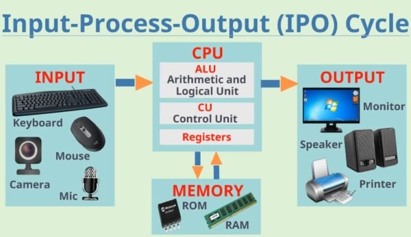
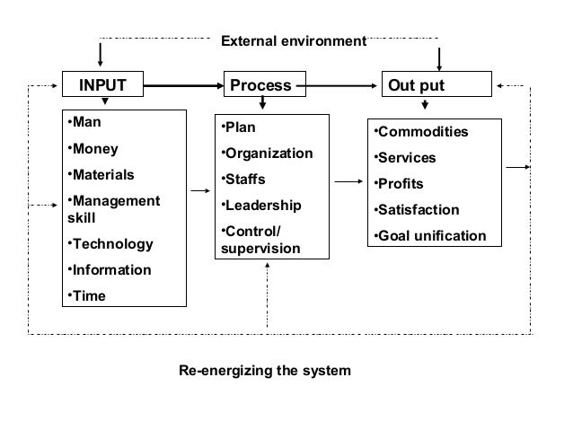
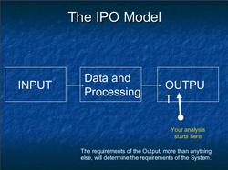
Input
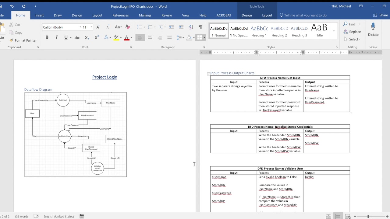
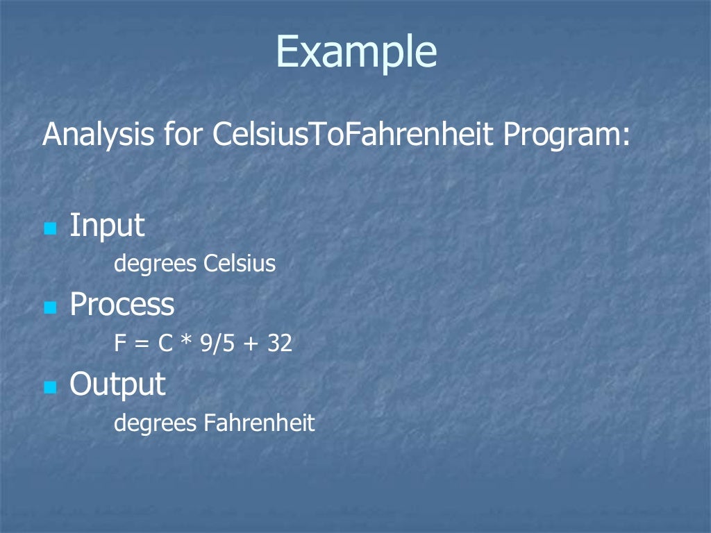
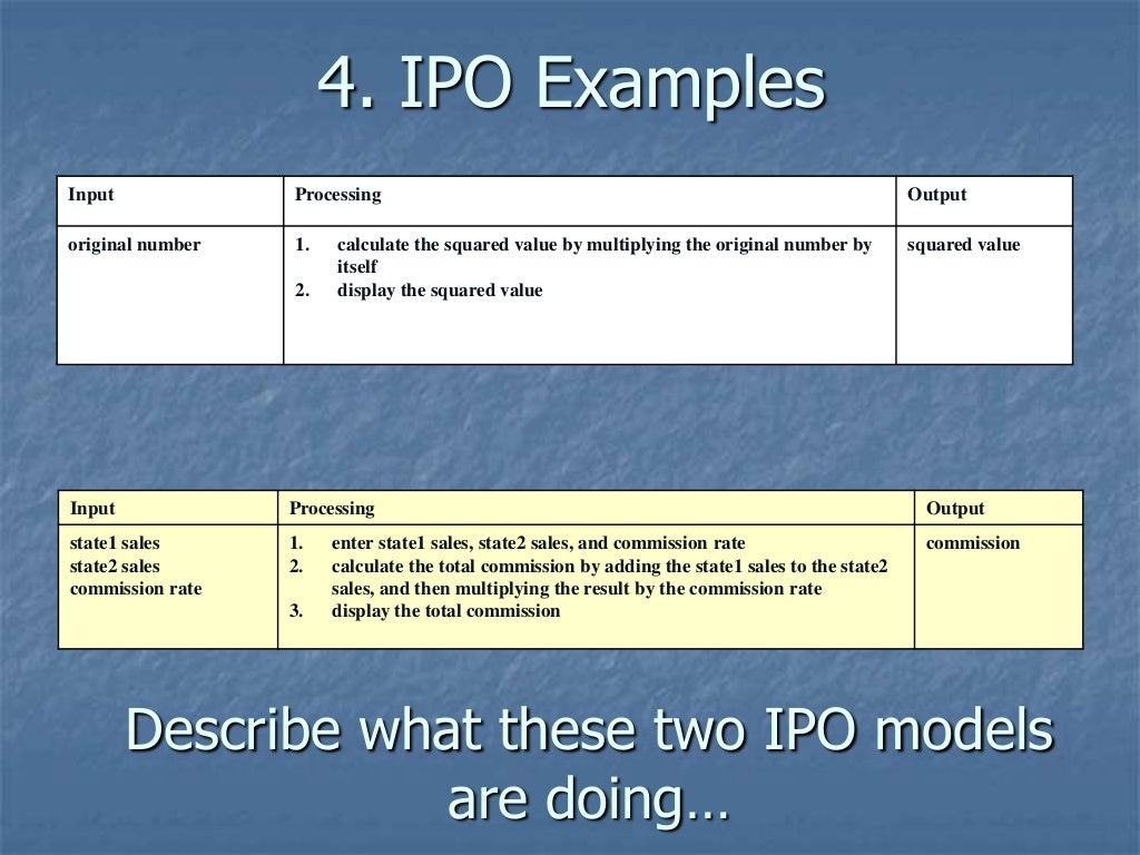
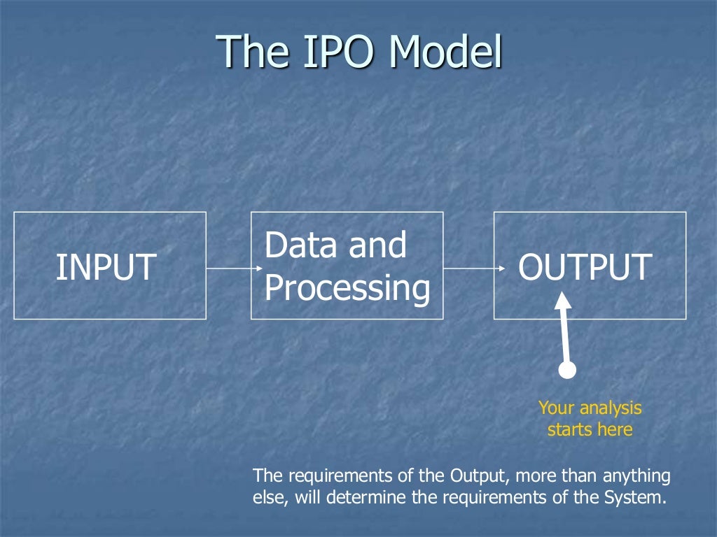
First and foremost, let’s have a look at the input stage of an IPO chart. The input represents the data or information that is required to initiate a process. It could be anything from user inputs, sensor readings, or pre-existing data. Remember, the accuracy and relevancy of the input greatly impact the overall output of the system.
Process
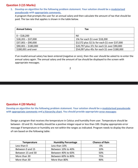
Next up, we have the process stage. This is where the magic happens! The process is the series of actions or operations that are performed on the input data. It could involve calculations, manipulations, or transformations. The main goal of the process stage is to convert the input data into meaningful outputs.
Output
Finally, let’s talk about the output stage of an IPO chart. The output represents the result or outcome of the process. It could be in the form of reports, visualizations, or any other format that conveys the processed information to the end-users. The output should provide valuable insights or fulfill the intended purpose of the system.
That’s the basic structure of an IPO chart – input, process, and output. By visually representing these elements, we gain a better understanding of how information flows within a system and how it is transformed along the way. IPO charts are widely used in software development, business analysis, and many other fields where processes and information handling play a crucial role.
If you’re interested in creating your own IPO charts, there are several software tools available that can assist you. These tools often provide pre-designed templates and intuitive features to make the chart creation process easier. Some popular options include Lucidchart, Microsoft Visio, and Google Drawings.
Remember, when constructing IPO charts, it’s important to carefully analyze the input data, define the necessary processes, and ensure that the output aligns with the desired objectives. This will help in creating accurate and efficient systems.
I hope this introduction to IPO charts has been valuable to you. Start using these charts to visualize information flows and processes, and you’ll quickly see how beneficial they can be in understanding complex systems. Good luck!
If you are looking for The ipo model you’ve visit to the right place. We have 35 Pictures about The ipo model like Ques15, What is an IPO cycle? Draw the block diagram of IPO cycle, The ipo model and also IPO Model – YouTube. Here it is:
The Ipo Model
www.slideshare.net
ipo
Explain The IPO Cycle With Diagram – Brainly.in

brainly.in
ipo cycle diagram explain
The Ipo Model
www.slideshare.net
ipo
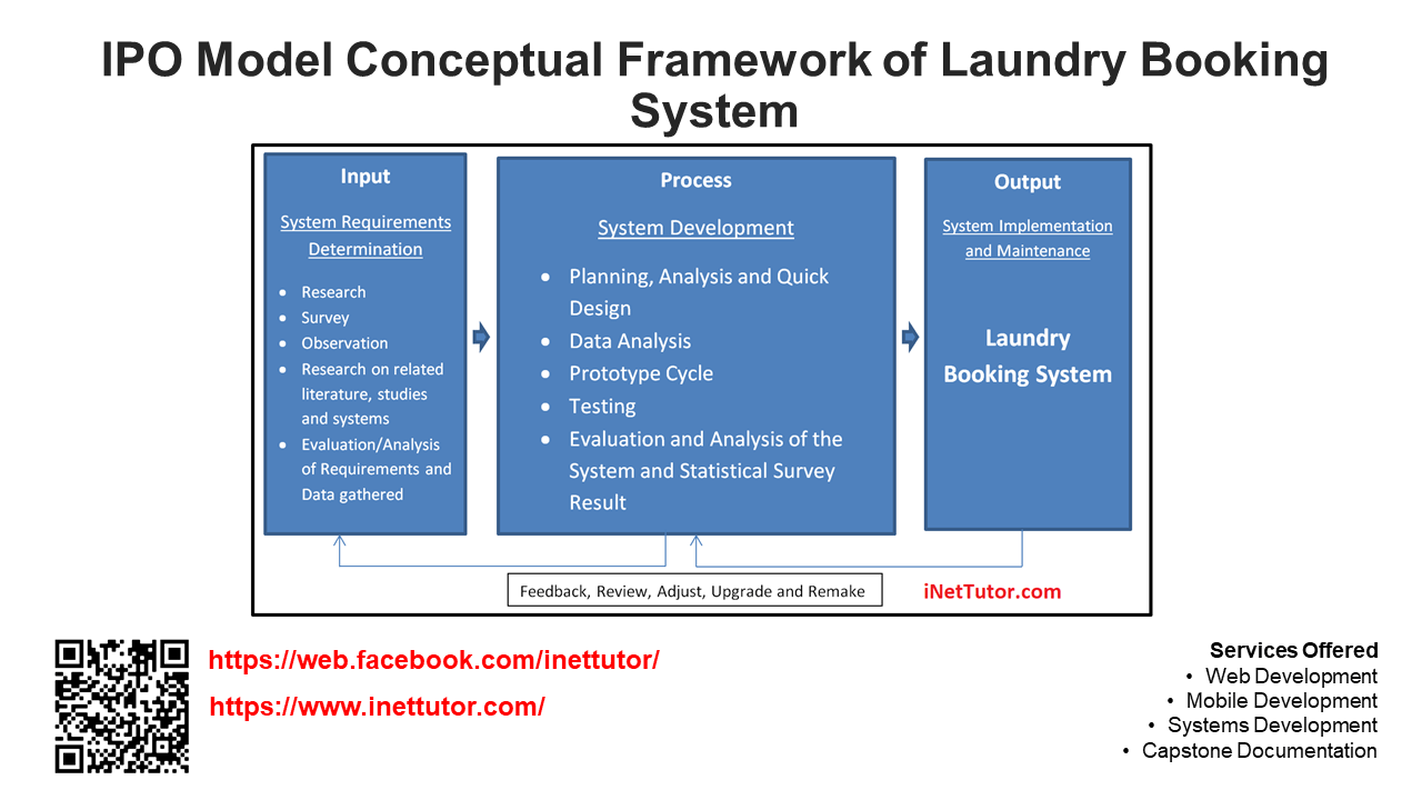
Cadre Conceptuel Du Modèle IPO Du Système De Réservation De
quedulourd.com
Wikipedia | Kushima.org

www.kushima.org
ipo kushima het input schema functional
Solved Question 1 [5 Marks) Draw A Defining Diagram (IPO | Chegg.com
www.chegg.com
Software Development Cycle For Data Management System | Rob Abdul

www.robabdul.com
ipo model cycle development software figure evolutionary
What Is Program ? Draw The IPO Cycle – Brainly.in

brainly.in
ipo
IPO Cycle – Simply Coding

simplycoding.in
ipo
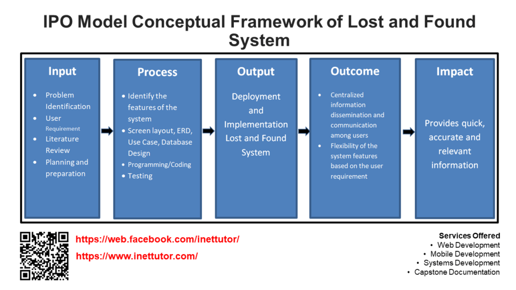
Cadre Conceptuel Du Modèle IPO Du Système Des Objets Perdus Et Trouvés
quedulourd.com
IPO Cycle – Simply Coding
simplycoding.in
ipo cycle simplycoding
The Ipo Model
www.slideshare.net
ipo
COMPUTER SCIENCE : Information Processing Cycle (IPO) Model

hercomputerforyou.blogspot.com
ipo cycle
IPO Cycle Of Computer – YouTube

www.youtube.com
ipo
IPO Cycle| Input Process Output| IPO Cycle Explanation With Example

www.youtube.com
ipo
Ipo Model PowerPoint Presentation SlideS
www.slideshare.net
ipo
Ques15, What Is An IPO Cycle? Draw The Block Diagram Of IPO Cycle

brainly.in
ipo cycle diagram block computer draw question science
ENGINEERINnone – The Ipo Model Also Known As The Ipos Involved Two Or

www.coursehero.com
The Proposed IPO Model For Measuring IS Project Success | Download

www.researchgate.net
ipo proposed measuring
IPO Model (Adopted From [13]) | Download Scientific Diagram
![IPO Model (Adopted from [13]) | Download Scientific Diagram](https://www.researchgate.net/profile/Aang-Subiyakto/publication/260945282/figure/download/fig4/AS:667618365173772@1536184030909/IPO-Model-Adopted-from-13.png)
www.researchgate.net
ipo
The Simplified IPO Model | Download Scientific Diagram

www.researchgate.net
ipo simplified
Ipo Cycle – Computer Systems Input Process Output – Ipo Stands For

eldiaines.blogspot.com
ipo
Explain The IPO Cycle With Diagram – Brainly.in

brainly.in
inputs process processing system output ipo diagram cycle function python explain animated example tea systems making simple outputs cup diagrams
Input Process Output (IPO) | Download Scientific Diagram

www.researchgate.net
ipo
The IPO-Fits-All Model Needs To Be Reformed. Here’s How.

addx.co
uhd ipo reformed addx expr directed iras colourbox earnings barewalls manhattan gilded
How To Draw IPO Charts (Input, Process, Output Charts) – YouTube
www.youtube.com
ipo input
IPO Model/system Model
www.slideshare.net
ipo input
Draw Two Examples That Can Be Compared With Ipo Cycle – Brainly.in

brainly.in
ipo cycle examples process output input computer draw compared two
IPO Cycle – Simply Coding

simplycoding.in
ipo
IPO Model – YouTube

www.youtube.com
ipo model
What Do You Understand By IPO Cycle ? Describe With Figure – Brainly.in

brainly.in
ipo cycle computer process figure science processing systems describe understand structure information program
Programming: The IPOS Cycle

progr-harrykar.blogspot.com
cycle ipos computer storage programming selection software development
Illustration Of Generic IPO-model. | Download Scientific Diagram

www.researchgate.net
System Model (IPO) – Kevin Achaia's Portfolio
ramnarine.weebly.com
ipo model system work diagram ramnarine weebly
Draw IPO CYCLE FOR WASHING CLOTHES – Brainly.in

brainly.in
ipo cycle draw brainly diagram washing clothes computer
Ipo cycle. Uhd ipo reformed addx expr directed iras colourbox earnings barewalls manhattan gilded. Ipo cycle